ROCK FISSURE MASS MASS(ES) COMING TOGETHER CAVES LANDSCAPE CAVENOUS INSIDE?/OUTSIDE? EXPERIENTIAL ZONES SEQUENCE SPACES BETWEEN SPACES
SPACES CHARACTERISED BY OUR SENSES - ROUGH/SMOOTH/HOT/COLD/FREEZING/FRAGRANT/DEEP/DAR/MISTY/COLOURED/WARM/COOLER/QUIET/NOISY
Route Thoughts
Speculative abstractions and Projective formulations of my world
Saturday, 16 June 2007
Monday, 4 December 2006
OMA's Casa de Musica in Porto
(This image is a Wikipedia image and licensed under Creative Commons)
This building is luminous inside and out.
Entering on the first floor via an external stair that was wide, light and strangely lacking in pomposity at the main entrance, the 100million euros construction budget does not so much shout as glows. The stairs were also slippery when wet but once inside, the aluminium floors and stairs, the fair-faced concrete with inset signage in over-sized alphabets, the frameless glass balustrades, the stainless steel handrails; even the perforated metal sheets forming wall panels and ceiling half concealing services and an inset aluminium handrails, take over. Perhaps it's the lack of any seams, or protruding ones at least, that gives the interior such an aura. Or it might be the many shades and sheens of gray in a interior that leans this way and that; and which extends in multiple directions in different volumes that wows enough for one to forget snagging. Nevertheless, the glow beckons and I feel myself following (moth to flame or does Rem's assertion that gray spaces make people want to move on while brighter, bolder colours make people stay, actually supported empirically?)
That luminosity is amazing especially as a second look at the photographic evidence of the same interiors reveal the crudeness of the construction and the expanse of building innards and services on display. Is OMA relying on the spectacular to discredit the requirement of the spatial and the tectonic for architecture to exist? Or Lars Spuybroek's (or was it Kas Oosterhius') division of contemporary architecture practice as Conceptual/ Formal/ Technological-Constructional practices more applicable here as a filter to understand OMA's rendition of a musical experience?
All in - my brief experience of Porto's musical box was rather magical.
Sunday, 3 December 2006
Siza's Building Anxieties
Siza's approach to the siting of the museum in the northwestern part of the Quinta de Serralves park and the use of building volumes to transform the park is a continuing theme in his work. The design of movement through the building and the layering of space by leading the eye beyond the immediate enclosure to create an awareness of the entire transformed site, can also be traced to much earlier works.
The articulation of an idea architecturally can arguably be divided to the spatial and the architectonic. Hence, tying the organisation of a building and it's construction together in any architectural transformation is essential.
In the Serralves museum, large windows and full-height openings are utilised to frame unexpected views of the garden to connect the building to its site. While doing so, the eye traverses the space of the gallery in between and creates a rippling effect that layers the interior spaces. In the picture above, the main circulation route, albeit large enough to form interstitial galleries, has its own axis distracted by a window and terrace in the far wall beyond a main space to link the interior to the outside. This technique is used intermittently throughout and from different types of interior spaces; it becomes the spatial device to include the park setting into the museum visitor's perception.
But he goes beyond spatial manouvres and imbues his building with the same desire. The manner in which he layers his internal finishes - turning stone around corners and over different levels - is evidence of the same idea to lead the eye beyond the immediate.
One of Sergison Bates talked about architectural practice and how they thought about it - the process, the methods and future emphases. Sergison cited Alvaro Siza Vieira's work and revealed that "thirty years ago every detail he was ever going to use had been determined in his studio, and yet sculpturally and formally he has an amazing freedom that exists within that set of conditions."
Siza's architecture employs movement to create sequences, sequences to lead and for the opportunity to distract, to create axes - both visual and routes.His spaces frames and elongates and is impressive in its virtuosity. It was interesting to note however that there is a certain anxiety with which Siza Vieira builds that was apparent in his early work and which still shows in his more recent Serralves Museum.
Siza's internal finish is somewhat uneasy. The fact that materials are layered on top of another is never hidden and junctions are not always easily terminated. His building details are seldom used to quiety resolve or disappear. Instead, it points around a corner, makes aware of its artificialness or points to another adjacent space.
An example of how he overlaps spaces can be seen in how he decides to land his stairs and again, allowing building to accentuates an idea.
To see how he terminates finishes to accentuate junctions and intersection of many different spaces and routes, look to the first photo at the top of this post.
Another look at the close-up picture of the marble parapet in the library mezzanine exemplifies how a hierarchy between the L-shaped space is established.
Again in the Serralves, a stone skirting continues beyond the edge of a floor - as balustrade height wall panels along the ramps and on the walls of the lower gallery to the right. The changes in direction, the junctions and intersections are never easy ones and Siza deals with them to activate an understanding of material layers, to bind levels together, to accentuate the different spaces being brought together in unequal measures at a corner, a parapet or the sides of a ramp.
Despite Sergison's assertion that Siza concluded his building solutions education phase early on to move on to other preoccupations, evidence of early issues are still in evidence. In construction, Siza answers questions of detailed design by tying building solutions to architectural and spatial ideas and the deliberation can be felt. The thought process and the sometimes crude solutions are there for all to see even if the more ornate junctions in the earlier Casa de Cha (see 31/11/2006 post) have given way to quieter transitions; the uneasy manner remains.
Two things coming together and recognising each other autonomously - ramp meeting floor, skirting sitting with wall and then meeting ramp. There is a certain deliberation evident and even as these have been opportunistically utilised, the anxieties that surround them are palpable. And in the end, the fact that they appear in projects old and new from an acknowledged master that is Siza Vieira no less, is somehow comforting.
Thursday, 30 November 2006
Alvaro Siza's Casa de Cha Boa Nova
A Frank Lloyd Wright influence is discernible in this very earlywork of Siza's - his Casa de Cha Boa Nova in Portugal.
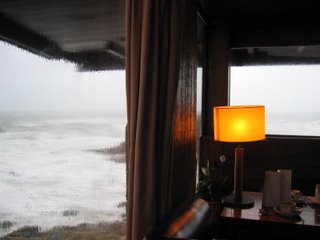
The sequence begins upon arrival via flights of expansive steps but once inside, the flat horizontal spaces and their interconnectedness on varying levels is reminiscent of Wright's ideas. A cliff-drop view and an exaggerated overhang framing the distant view, in this instance - a timber panelled ceiling continuing beyond as the canopy soffit providing a panoramic of the Atlantic ocean - is another palpable desire of the architect of this cliff-side structure. As with most of his projects, Siza designed the furniture and fittings and the proportions accentuate this horizontality and provides another clue to the architect's intentions.
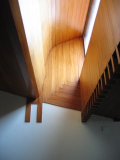
The fluid interconnection of internal space lends the feeling of walking outdoors while a layering of spaces from the outside in and out again through a control of light within that at once harnesses without but creates sequences through varyingly lit niches heightens this idea. As with Wright's designs on wooden fixtures, panellings and furniture before him, Siza clearly thought that designing the junctions and intersections of his finishes was an design issue he had to face. He was clearly making sense of how material is laid onto another and how it meets the other: in this instance with intersecting protrusions of timber internal panels as he carved and moulded the volumes.
And in turn, Siza might have then infected Enric Miralles
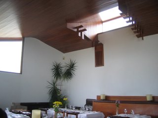
Enric Miralles' volume and curves are palpable in the skylights moulded and chamfered in the ceiling as well as the concrete shutter finish seen in the previous picture. I can imagine Miralles moving through this tea house, dwelling on the terrace in summer and sitting in the bar area by the boulders that cascade down towards the edge of Portugal facing the Atlantic and musing about materials, about finishes and textures, about continuous surfaces and sensuous volumes. I imagine Miralles musing about the idea of layers of internal finishes that end up becoming the enclosure and choosing abstinence. I imagine Miralles experiencing for himself Siza's 'spaces of movement' and the sequences of those space and interconnected levels and taking it all to heart. I imagine Miralles encountering that skylight as he entered the Casa and then learning the curves and the lines by hard, absorbing it in preparation for his own future projections; and then deciphering it in the ceiling and roofscape in the main dining hall as rolling volumes and intersecting sloping planes and knowing that therein, his architectural invention shall spring forth.
Labels:
alvaro siza,
casa de cha,
frank lloyd wright,
miralles
Subscribe to:
Posts (Atom)